Choosing the perfect wedding colour palette can significantly influence the overall aesthetic of the big day. It is essential to select colours that reflect the personality of the couple and harmonise with the chosen venue. The right colour theme sets the tone for everything from invitations to table settings and floral arrangements, making it a vital aspect of wedding planning.
To begin the selection process, couples should consider the season in which they are getting married. For example, spring often embraces pastel shades, while autumn may favour rich, warm hues. Incorporating personal preferences and inspirations can also help in narrowing down choices and creating a unique vision.
It’s beneficial to create a mood board showcasing potential colour combinations. This exercise can provide clarity and inspire creativity, ensuring that the final colour palette resonates throughout all elements of the wedding. By approaching the selection process thoughtfully, couples can confidently establish a colour scheme that enhances their celebration.
Understanding the Importance of a Wedding Colour Palette
A well-chosen wedding colour palette acts as the foundation for the wedding’s aesthetic. It influences the overall atmosphere, reflects personal styles, and ensures cohesion across various elements of the celebration.
Setting the Tone and Atmosphere
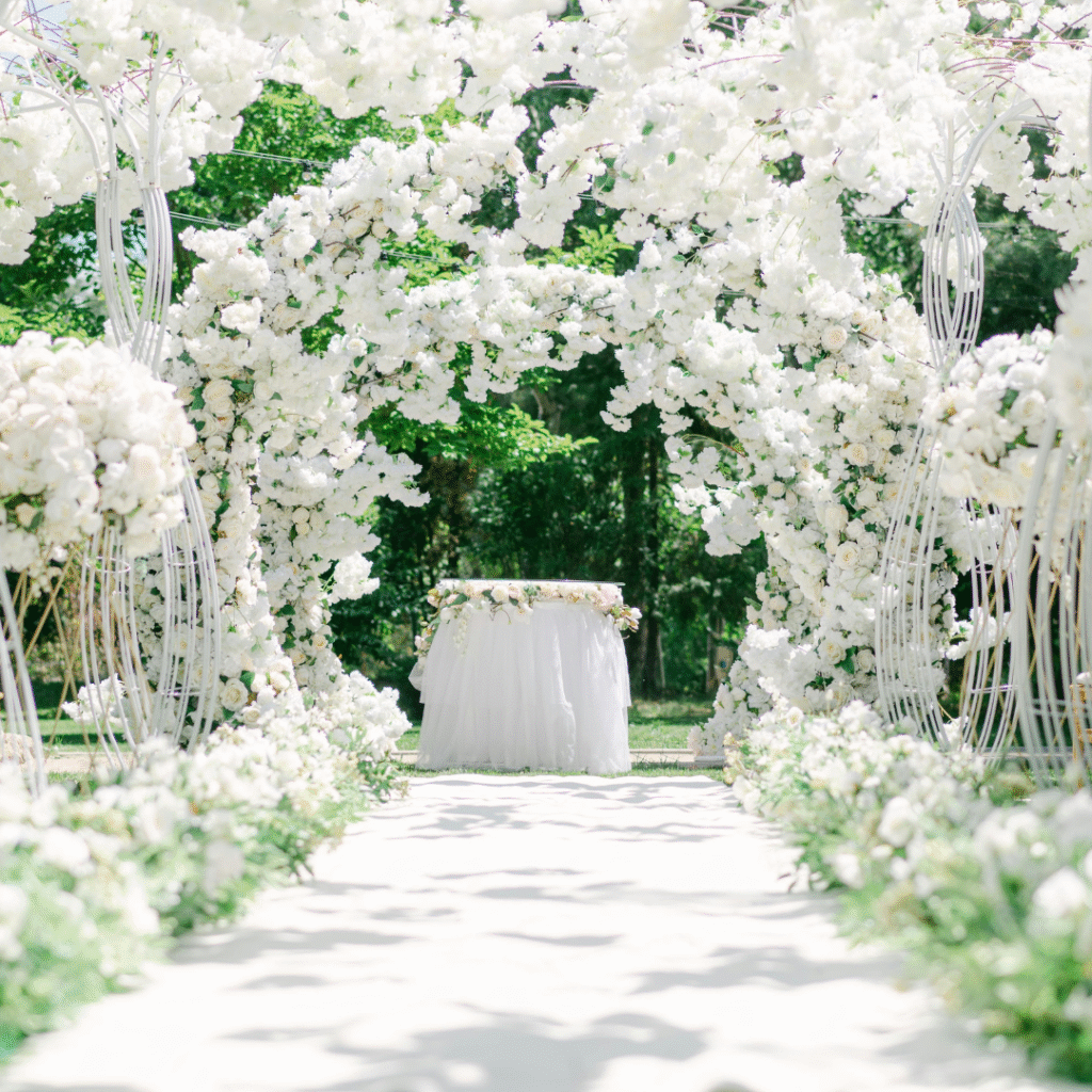
The colour palette sets the tone for the entire event. Different colours evoke distinct emotions and moods. For instance, soft pastels like blush pink and mint can create a romantic and serene atmosphere, while bold colours like red and gold exude passion and elegance.
Choosing the right hues can enhance the ambience of the venue, influencing lighting and decor. Consider how these colours will look in photographs, too. The interplay of colours will affect how guests experience the event, highlighting important moments during the ceremony and reception.
Reflecting Personal Style and Preferences
A wedding colour palette should reflect the couple’s personal style and preferences. Choosing colours that resonate with their identity creates a more meaningful backdrop for the celebration. Couples may opt for classic combinations, such as navy and white, or go for vibrant palettes, incorporating colours like fuchsia and orange.
Incorporating personal stories behind certain colours can add depth to their choice, making the occasion even more special. Whether opting for tradition or personal expression, the chosen colours should align with their vision for the day.
Enhancing Cohesion throughout Wedding Elements
Cohesion is crucial for creating a harmonious look. The wedding colour palette should be integrated across various elements such as invitations, flowers, attire, and table settings. This integration maintains visual consistency, allowing all components to work together seamlessly.
For example, if the chosen colours include emerald green and gold, these should appear in the bridal bouquet, table linens, and even the cake design. This thoughtful approach enhances sophistication and elegance, providing a polished appearance that resonates with guests.
In conclusion, a carefully selected wedding colour palette plays a vital role in crafting a memorable and cohesive wedding experience.
Key Factors to Consider When Choosing Your Wedding Colours
Selecting the right colours for a wedding involves several crucial elements. Seasonal influences, venue characteristics, the chosen wedding style, and personal meanings all play significant roles in this decision.
Seasonal Influences and Trends
The wedding season shapes colour choices significantly. Each season offers distinct palettes that reflect its essence.
- Spring: Soft pastels such as blush pink, lavender, and mint green resonate well during this time.
- Summer: Bold colours like coral, vibrant blue, and sunflower yellow are popular.
- Autumn: Earthy tones, including burnt orange, deep red, and golden yellow, align with the changing leaves.
- Winter: Rich colours like emerald green, navy blue, and burgundy evoke a warm atmosphere.
Moreover, current trends may influence selections. Trend forecasts often highlight specific colours that can enhance the overall look of a wedding.
Venue Aesthetics and Location
The wedding venue significantly impacts colour choices. Venues can vary widely in terms of decor and architectural style, necessitating thoughtful colour coordination.
- Natural Settings: Outdoor venues may benefit from colours that complement the landscape, such as greens and browns.
- Classic Venues: Historic buildings or grand ballrooms often do well with rich hues or elegant neutrals to enhance their elegance.
- Themed Venues: If the venue has a specific theme, such as a rustic barn, colours should reflect this to maintain coherence.
Additionally, consider aspects like lighting. Natural light can make colours appear different, while artificial lighting can bring warmth or coolness to colour selection.
Wedding Style and Theme
The chosen wedding style influences colour combinations. A bohemian wedding may call for a mix of vibrant, eclectic colours, while a more traditional celebration may favour muted, classic tones.
- Formal Weddings: Typically utilise sophisticated colours like navy, gold, or silver.
- Casual Weddings: Lighter, more playful colours like peach or turquoise can create a relaxed atmosphere.
- Themed Weddings: Whether vintage, rustic, or modern, the theme will dictate compatible colours.
Couples should envision how their colour choices align with their overall style. This creates a cohesive aesthetic throughout the event.
Personal Symbolism and Meaning
Personal symbolism significantly influences colour choices. Many couples select colours based on emotional significance or shared experiences.
- Heritage: Certain colours may represent cultural significance or family traditions.
- Memories: A couple might choose colours reminiscent of their first date or favourite holiday.
- Desires: Some colours may symbolise qualities they wish to embody on their wedding day, such as red for love or blue for tranquillity.
Incorporating personal meaning adds a layer of depth to the wedding palette, making the day even more memorable. Couples are encouraged to choose colours that resonate uniquely with them.
Building Your Perfect Wedding Colour Palette
Creating a harmonious colour palette is essential for setting the mood of a wedding. It involves careful selection of colours, coordination of accents, and maintaining balance for a cohesive look. Using inspiration boards can provide visual guidance and enhance the overall design.
Selecting Your Base Colour
Choosing a base colour is the first step in building a wedding colour palette. This colour will define the overall theme and guide the selection of other shades. Popular choices include navy, ivory, and blush.
When selecting the base colour, consider the season and venue. For a spring wedding, mint or peach could evoke freshness. In contrast, burgundy or maroon might suit a winter event. Ensure the base colour resonates with personal tastes while complementing the couple’s style.
Incorporating Accent Colours and Metallics
After establishing a base colour, adding accent colours enhances the palette’s depth. Accent colours like gold, red, or fuchsia can create striking contrasts. Pairing lighter shades, such as blush or lilac, with deeper tones enriches the visual impact.
Metallic elements, especially metallic gold, elevate the elegance of a palette. These can be introduced through decor, stationery, or even bridal accessories. Mixing textures, such as satin with metallics, adds interest and sophistication to the overall look.
Balancing Hues for a Cohesive Look
Maintaining balance among colours is crucial for a unified appearance. This involves blending shades of similar saturation and temperature. For instance, a palette featuring both emerald green and orange can be harmonised by including a neutral like white or ivory.
Experiment with variations to find the right balance. If the base is a bright colour, incorporate softer hues as accents. A well-balanced palette draws the eye without overwhelming it, ensuring a visually appealing aesthetic that stands out.
Utilising Inspiration Boards for Visualisation
An inspiration board serves as a valuable tool for visualising the wedding colour palette. This can be created physically or digitally using platforms like Pinterest. It allows for the gathering of images, fabric swatches, and colour samples.
By curating elements that resonate with the chosen palette, couples can better understand how colours work together. This process can highlight the interplay of colours, ensuring that every element from the flowers to the table settings fits cohesively within the desired aesthetic.
Applying Your Colour Palette to Wedding Details
Incorporating the chosen colour palette into various wedding details is essential for creating a harmonious and cohesive atmosphere. From the bridal party’s attire to the decor and stationery, each element should reflect the selected colours.
Bridal and Bridesmaid Attire
Choosing the right colours for bridal and bridesmaid attire plays a crucial role in setting the tone. The bride may select a wedding gown in a classic ivory or white, complemented by accents from her colour palette.
Bridesmaid dresses can showcase the palette effectively. Options include:
- Solid Colours: Each dress is in different shades of the palette.
- Patterns: Floral or abstract designs incorporating the colours.
Selecting a mix of styles also adds visual interest. Consider accessories like shoes, jewellery, and flowers that tie in with the chosen colours.
Decor, Florals, and Stationery
Decor and floral arrangements present another opportunity to utilise the colour palette. Table linens, centrepieces, and chair covers should reflect the chosen hues.
Floral arrangements can incorporate a variety of blooms that match or contrast with the palette. Some popular options include:
- Bouquets: Featuring a mix of flowers in the wedding colours.
- Centrepieces: Using vases in complementary shades.
Stationery, including invitations and menus, should echo the colour scheme. Custom designs can enhance the overall aesthetic, using colour-matched envelopes and fonts.
Reception and Ceremony Styling
Styling the ceremony and reception should align with the colour choices to create a cohesive look. For the ceremony, consider using banners or backdrops that feature the palette.
At the reception, applying colours to the tablescape enhances the ambience. Options include:
- Table Runners: In shades that echo the palette.
- Lighting: Coloured uplighting to create a mood.
Focus on details like napkins and place cards that feature the colour scheme. These elements reinforce the palette and create a unified and elegant setting.